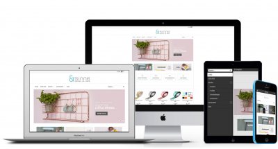
Essential tips from a professional ecommerce designer

Every year, more than a hundred thousand new online stores pop up. Not even taking into account all the newly created Ebay, Etsy sites out there. In fact, in some countries there are now more online stores than physical stores. Of course the big question is: how do you stand out in that enormous crowd? We have six top tips for a great design that truly stands out. Enjoy!

A peek through the window of a physical store gives you a good idea of what to expect. The same goes for online stores. It only takes a quick glance to form a first impression. Research actually shows that you need no more than three seconds to convince visitors to browse your online store. The product range is, of course, very important, but a nice and reliable design is equally powerful. You need to stimulate your visitors to ‘convert’ – or simply put, to buy. Discover our handy tips to make an unforgettable first impression!
Choose a style that matches your product range and vision. A unique identity for your online store is something to be proud of, and it sells too! Visitors look for a style that comes across as reliable and identifiable. A catchy name, as well as a professional corporate style and logo are a must!

2. Entice your visitors with a CTA
Ensure your homepage boasts a clear focus. A good CTA (‘call to action’, such as a ‘Buy now!’ button) guides your visitors in the right direction, guaranteeing a good customer journey.
3. A good layout makes it easy to choose
If your visitors cannot see the wood for the trees, they’ll give up and continue their search elsewhere. And that’s exactly what you want to avoid. Ensure your online store boasts a well-structured navigation to guide your visitors through your product range. Use a maximum of six main categories and add your subcategories, if any, below.
4. Leave enough white space
White looks professional and guarantees a clean, organized layout. After all, that’s why text has been presented black on white for centuries. We also like to use white in our designs and make sure there’s enough white space surrounding key design elements.

5. No more than three base colors
A colorful online store is one thing, but there’s no need to turn it into a circus. Use a maximum of three base colors and ensure a good contrast between the shades. That way, your colors will remain recognizable and your texts will be easy to read.
6. Give reviews an A-location
Reviews are essential for your online store. “If others like it, I’m sure I will too” – that’s what your visitors need to think. Make sure your reviews are displayed prominently and are easy to read. Success guaranteed!
Don't forget, it only takes 3 seconds for visitors to decide whether they should stay on your site. Make them count!
