Five quick tips for a user-friendly online store!


Day in, day out, we work hard to ensure your online store is as user friendly as possible by default. That way, you don’t need to worry about things such as alignment and button placement. However, there are many settings you can – and should – take control of to boost the user friendliness of your store (and your turnover!).
1. Go for a responsive store
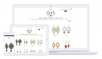
Did you know that, on average, more than half of all your visitors browse your store using a mobile device? If your store is not responsive yet (meaning it is automatically optimized for small screens), it is not user friendly, because your texts will be small and illegible, and your links will be virtually impossible to click on when using a mobile device.
No worries, though, you can make the layout of your online store responsive with just a few easy clicks. Your store will become more user friendly in no time! Go to ‘Settings/Design/Themes’ and select the ‘Clear as Day’ theme. This will automatically make your store responsive, optimizing it for various screen sizes.

2. Choose a set number of products per page
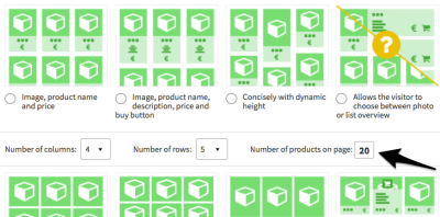
You can choose how many products are displayed on each page for every display type. We’ve grouped all the different product display types in two categories: display with small images and display will large images. Go to ‘Settings/Design/Product settings’ to choose how many columns and rows you would like to display on each page, for both categories. Try out different options to find out what works best for your store. If images are important to you, opt for a larger display with few columns. If, on the other hand, photos are less important, opt for several columns, so that you can display a lot of products on the screen at once.

3. Order and stay on the same page
Under ‘Settings/Modules/Shopping cart’ you can select whether your customers will automatically be redirected to the shopping cart once they’ve ordered, or whether they can stay on the page. If you choose the latter, a message will be displayed stating the product has been successfully added to the shopping cart and they can continue shopping. You can even opt to display matching products on the confirmation screen.
Allowing shoppers to stay on the same page once they’ve placed an order can boost your conversion rate, as it entices your visitors to continue browsing and add more products to their shopping cart.

4. Activate your search bar
A search bar is the perfect tool to help your visitors find exactly what they’re looking for. To activate your search bar, go to ‘Settings/Modules/Search’. Don’t forget to actually add the search bar to your online store afterwards. To do so, go to ‘Settings/Design/Store layout’. We recommend you place the search bar in the top right-hand corner. To find out more about the best layout for store, click here.

5. Display the various steps in the order process
Show your visitors where they are in the order process. That way, they’ll know exactly how many steps are left for them to complete their purchase, which will encourage them not to abort the order process. To activate this setting go to ‘Settings/Design/Template settings/Shopping cart’.

Had you already followed these five tips? Then you’re definitely on the right path! :) Do you have any additional tips to increase the user friendliness of your online store? Let us know!
