Impress your visitors with an effective homepage


The homepage is the page that many – if not most – visitors see when they first visit your online store. So it comes as no surprise it has to be as targeted and efficient as possible. This entices your visitors to browse your other pages, which, in turn, boosts your conversion rate!
What are the goals of a homepage?
Visitors to your online store have three questions:
- Where am I?
- What is sold here?
- Why should I buy my product(s) here and not elsewhere?
In a nutshell, the main goal of your homepage is to convince visitors to browse your site and place an order. As such, your homepage plays a key role in boosting your conversion rate.
A good homepage should feature the following:
1. A logical page layout
Most online shoppers are used to a specific page structure, which they expect to find in your store too. So, although we often encourage unique, striking features, in this case, it’s best to stick to the traditional layout, which consists of:
- A page header with a logo on top
- A navigation menu on the left-hand side or at the top
- A shopping cart in the top right-hand corner
- A search bar at the top, generally in the right-hand corner or just below the shopping cart
- A footer at the bottom with – in random order – your contact details, service details (general terms and conditions, privacy policy etc.), reviews, a newsletter and so on.
Here’s an example of a good homepage (points 1 to 4).
Footer (point 5). This is just an example. Needless to say, you can choose the set-up that works best for you, as long as it contains the key data.
2. The right look
It may seem obvious, but a good look is a must, and many online stores fail in this view. After all, visitors have often already formed a first impression even before looking at your photos or reading your texts. A good design definitely contributes to a professional look.
There are no specific guidelines for a good homepage design, but here are a few useful tips:
- Stick to a simple, clean and transparent design to create a streamlined look.
- Avoid using too many colors.
- Visualize the different categories on your page. This allows you to direct browsing visitors exactly where they want to be.
- Don’t use any over-the-top banners that look like ads.
- Regularly update your homepage design, so as to encourage visitors to return and have a look around.
Is design not your cup of tea or are you running out of time? Then why not rely on a professional designer? Believe us, a good design is a lasting investment!
3. Text
As we explained earlier, your homepage should provide an answer to your visitors’ three key questions. So don’t start off with ‘Welcome’ (after all, have you ever heard of an online store where you’re not welcome?). Instead, come up with a brief, informative introduction to tell your visitors what your site can do for them, why they’ve come to the right place (including what makes you stand out from the crowd), and what makes your site so unique.
Don’t forget to include your main keywords on your homepage. Add information on yourself on a separate ‘About us’ page and make sure your texts are always up to date! A homepage listing promotions that expired two months ago doesn’t come across as very reliable, does it?
Tagline
Come up with a good tagline. A tagline is a sentence (that often accompanies your logo), which explicitly states what your site stands for and what you’re good at. It has to be user-friendly and it might well be the most important text on your entire homepage, because it allows visitors to immediately decide whether or not your online store is relevant to them.
A good tagline:
- describes what you do, why you do it, and what you’re good at
- is brief and to the point
- keys into emotional factors
Here are a few examples of good taglines:
- Dreamkey – Stationery that makes life just a little bit more beautiful
- Duinrell – A splashing day out or a fun family holiday
- Nu.nl - Discover the latest news here!
Important note: a tagline is not a slogan. The latter is for advertising and marketing purposes, and describes the core tasks of your company. An example is 'Sense and simplicity' by Philips.
4. A logical category and product overview
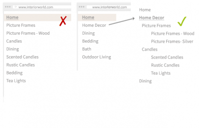
Make sure you group matching products together logically to boost the user-friendliness of your page. An example? If you have a home accessories store where you sell decorative products, such as photo frames and candle holders, but also other items, like cutlery, create category and product pages with a logical structure:
The example on the left-hand side lacks coherence. The one on the right is more logical and clearer. By grouping together matching products, you boost your chances of visitors ending up exactly where they aimed to be. Moreover, this approach increases your chances of securing a high ranking in search engines.

Most common mistakes
Here’s an overview of the most common mistakes when creating a homepage. Hopefully after reading this blog post you won’t make them anymore…
- Too much information: many online merchants use their homepage to showcase everything they’ve got. The result? Too many links, too many images and too much text. Avoid this at all costs! Your visitors will be overwhelmed and leave your store thinking you probably don’t have what they’re looking for.
- Excessively long (sub) navigation menus
- Illogical product categories
- A lack of consistency and structure
In the next blog post you’ll discover how to create effective category and product pages.
How do you welcome visitors on your homepage?
