Your visual identity: a powerful tool

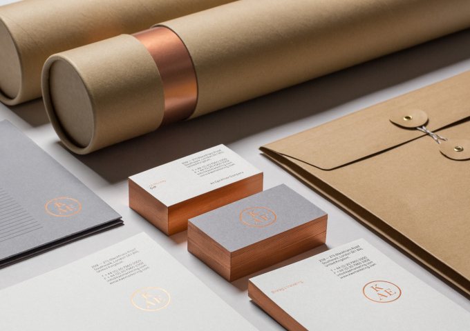
When building your online store, there’s a lot to consider. An excellent company name, for example. And don’t forget your visual identity! As the name suggests, it is literally your corporate style, which ensures your visitors immediately to see what it is that you do and offer. All your communication material should seamlessly match your visual identity.
Why should you have your own visual identity?
Your visual identity includes your logo and color scheme, among others. You are probably wondering what the point is of this visual identity. Well, first of all, it ensures you stand out from your competitors (provided it is a striking one, of course). It is also a handy tool to create a consistent image. By using your visual identity as a basis time and time again, all your communication material forms a harmonious whole. Last but not least, a professional visual identity builds trust among your visitors.
Analyze your company
In order to create a suitable visual identity, you should first take a very close and critical look at your company. What is your target audience and what is the look you’re after? Answer these questions by writing down a few keywords.
Create a mood board
When pouring your brand into a visual identity it could be handy to create a mood board. How, you ask? Collect various images, colors and materials that express the look and feel you’re after. It’s often easier to get an idea of the atmosphere you’re looking to create through a mood board rather than verbally. A handy tool to create a mood board is Pinterest (insert link to Pinterest blog post). When you save your mood board, you can restrict access to yourself only, so that no one else can view it.

Design your logo
Once you have a good idea of the look and feel you’re after, it’s time to design a logo. Since your logo must match your visual identity, these two design processes often go hand in hand. When designing your logo (if necessary, with some help from a third party), make sure:
- you use a clear font
- it can be used both in the color and the black-and-white version
- it is clearly visible even when used in a small format
- you opt for a timeless design. It may be tempting to follow the latest trends, but we suggest you create a logo that will still look hip and trendy in ten years’ time.
If you’re not a keen user of software packages such as Illustrator, you can use our logo creator on our platform to create your very own logo in just a few easy clicks. Another option is to work with a professional designer or to use existing logo templates.
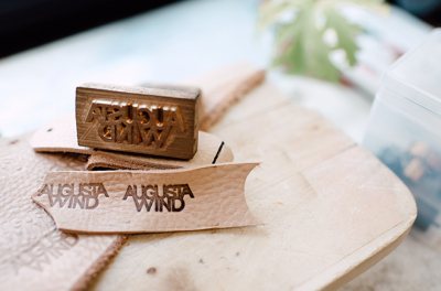
Choose a color scheme.
Go back to your mood board to choose a color scheme for your visual identity. Analyze which colors you’ve included the most in your mood board and ensure they match. Having a hard time assessing whether certain colors match? The Adobe Color website includes a vast collection of color combinations that can help you. Restrict yourself to a maximum of five colors and always use one specific color for key buttons and features.
Use your visual identity consistently
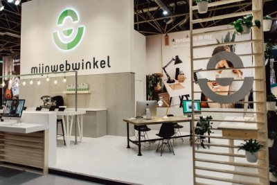
Once you’ve created your visual identity, it’s ready for use. Make sure you use it on all your communication materials (emails, letters, invoices etc.) and also feature it in your office or at event or trade-fair stands. If you have employees or often join forces with third parties, it might be handy to draw up a Style guide that clearly states which colors and fonts should be used. Try not to change your visual identity too often, because this jeopardizes your recognizability and makes it costly to re-print all your communication materials time and time again.
Header image: http://sociodesign.co.uk/
