5 tips for a responsive online store


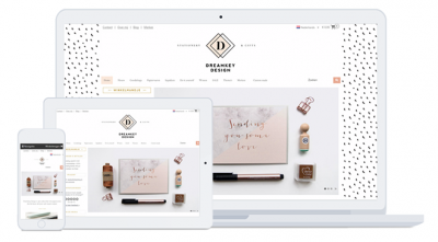
Online shopping using a computer is a fairly recent phenomenon and yet mobile shopping already seems to be taking over. MyOnlineStore has a responsive design, meaning your online-store design automatically adapts to the user’s device. However, you, as an online merchant, can also contribute to a more responsive design. Below you’ll find five handy tips to boost the way your website is displayed on mobile devices.
Click here to find out how to test the responsiveness of your website design.
Mobile surfing is on the rise, that much is certain. Back in 2015 it was already revealed that people google more using mobile devices than desktops. Desktops are still the main devices used for online shopping, but orders are increasingly being placed using tablets and mobile devices. The United Kingdom and Germany lead the way in terms of mobile purchases, and smartphone use is quickly exceeding tablet use for mobile shopping.
In a nutshell, the small screens of cellphones are quickly becoming big players. The five steps below will help pave the way for an excellent responsive site!
1. Check whether everything works
It may seem like a no-brainer, but things often go wrong! Check whether everything works on mobile devices. Many online merchants check whether their online store is responsive only once. They then add new images, videos and texts using their desktop and fail to check what the pages look like on mobile devices. And although the resolution of smartphones might be increasing significantly, their screens are only a fraction of the size of computer screens.
Every now and then check what important landing pages look like on various devices. Try the handy Responsive Design Checker!

2. Respond to your visitors’ behavior
It’s great to see everything working properly in your online store, but it’s even better to also have a good insight into your visitors’ behavior. Which device do they mostly use to visit your online store? And which device do they use to check out? You can view and compare these stats via Google Analytics and Google Webmaster Tools, and respond to them. If you find out you have a lot of mobile visitors, it might be a good idea to adapt your store’s design (see tips no. 3 and 4). You can also gear your marketing to your visitors’ favorite devices (see tip no. 5).
3. Enable the search feature and create an efficient navigation structure
Some online stores have a large navigation menu, possibly with several sub menus. That’s a good structure for desktop users, but on a small mobile device, navigating the site may be a bit harder. If you have a lot of mobile visitors, try to limit the depth and overall size of your navigation.
It’s also a good idea to enable the search feature. Go to Settings/Modules to enable the search feature in your online store. Afterwards, don’t forget to add the search bar in your store via Settings/Design/Store layout.
4. Edit the number of products per page
Ideally you show all your products on one and the same page, but on mobile devices that can be quite difficult, so you’ll need to make choices. Play around to see how many products you can display on a page. All product displays are subdivided into two categories, display with small images and with large images.
Go to Product settings and choose how many columns and rows you’d like to see displayed for each category. For some products it might be important to show clear photos. If that’s the case, opt for a large display with few columns. If not, go for more columns, which allows you to show more products on the screen.
5. Get the most out of your marketing tools
Have you noticed that a particular product tends to sell more via desktop than via mobile devices, or the other way around? Then use this knowledge to make the best possible use of your marketing tools by focusing on that specific device. An example: if you advertise via Google or Facebook, you can gear your ads specifically to mobile users, or exclude them altogether. Make sure to adapt your advertising budget to this, as it allows you to get the best ROI!
Conclusion
Bear in mind though that irregardless of how many obstacles you get out of the way, some products will always be ordered mainly using desktops, particularly expensive products and items that require quite a lot of prior research, such as TVs and mattresses. Likewise, there are products that are mainly bought via mobile devices, such as impulse and repeat purchases.
So, is your online store ready to welcome mobile shoppers?
About the author
This post was written by Dirkjan Vis, who owns the internet publishing house Eurolutions, which has produced various online publications for (budding) online merchants and online entrepreneurs.
