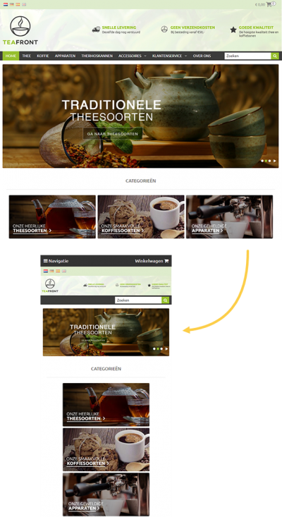
How can I test whether my online store is responsive?
When your online store is ‘responsive’, it is displayed correctly on PCs, laptops, tablets and other mobile devices. The page design automatically adapts to the screen size. So when designing your online store, it is important that you keep different screen sizes into account.
Breakpoints
For an online store to be displayed correctly on various screen sizes you need to keep account of the so-called ‘breakpoints’, specific points where the browser cuts off the page to ensure the page is displayed correctly. You’ll find these breakpoints at a width of 640 pixels and 1,025 pixels.
If the screen width lies below such a breakpoint, your page may be displayed incorrectly. The various elements in your online store may then be displayed in a vertical list rather than horizontally. The position of the navigation menu and shopping cart may also shift.
Tip
Did you know that you can set up a separate header for both the desktop and mobile versions of your webshop? This ensures that your header looks perfect on every screen size. You can adjust this via Settings / Design / Template settings / Header. Read more about adding your header in this article.
Mobile navigation & responsive settings
To ensure the best possible responsive design and mobile experience, you can select the display option that best suits your store under Settings / Design / Template settings / tab Navigation. In this menu you can select on which screen formats the navigation is minimized into a new navigation button and what this button will look like.
Keep account of the three different screen formats (breakpoints) your online store needs to be optimized for:
- Regular PCs with a resolution of over 1,000 pixels (large).
- Tablets and small laptops with a resolution of 600 to 1,000 pixels (medium).
- Phones and other small devices with a resolution of up to 600 pixels (small)
Responsive display tests
Keen to see what your online store looks like on screens of different sizes during the design phase? Of course you can switch between your mobile, tablet or PC, but there’s an easier way. You can resize your browser to test the various screen sizes.
How? Minimize your browser window by dragging a corner down to mimic the screen size of a tablet or smartphone.

When displaying your page in a smaller browser window, you will see whether or not the page contents appear correctly on smaller screens. The products will automatically be displayed neatly on any screen size without you needing to change any settings.
